HELPIKI — THE SERVICE’S BRANDING STORY

Client

Remote care service, a new project in the market.

Task

To tell the service’s story, to create the style and the design.

Work

name → logo → website development

SOLUTION

Vladimir’s and Andrey’s friends left Minsk. One of them asked to help find a doctor for his Mom. Another one – to congratulate his Granny. So the guys decided to create a remote care service. The idea is ready! Now they need a brand and a website. Vladimir and Andrey contacted Red Graphic...


— My name is Nadya, I am Red Graphic’s director and I usually do not take on any projects. That’s because the managers do it better and because tomorrow I’ll be leaving for a conference, and will spend the day after tomorrow at meetings, without even checking my mailbox.

But I still have my weaknesses – I like projects that involve both branding and design. And then I got itchy to do it, but had to cool down a bit to offer a moderate price, appointed myself a manager, and we started.


Service name
We invented several names. And were happy when the client chose our favorite one  — helpiki.
Logo
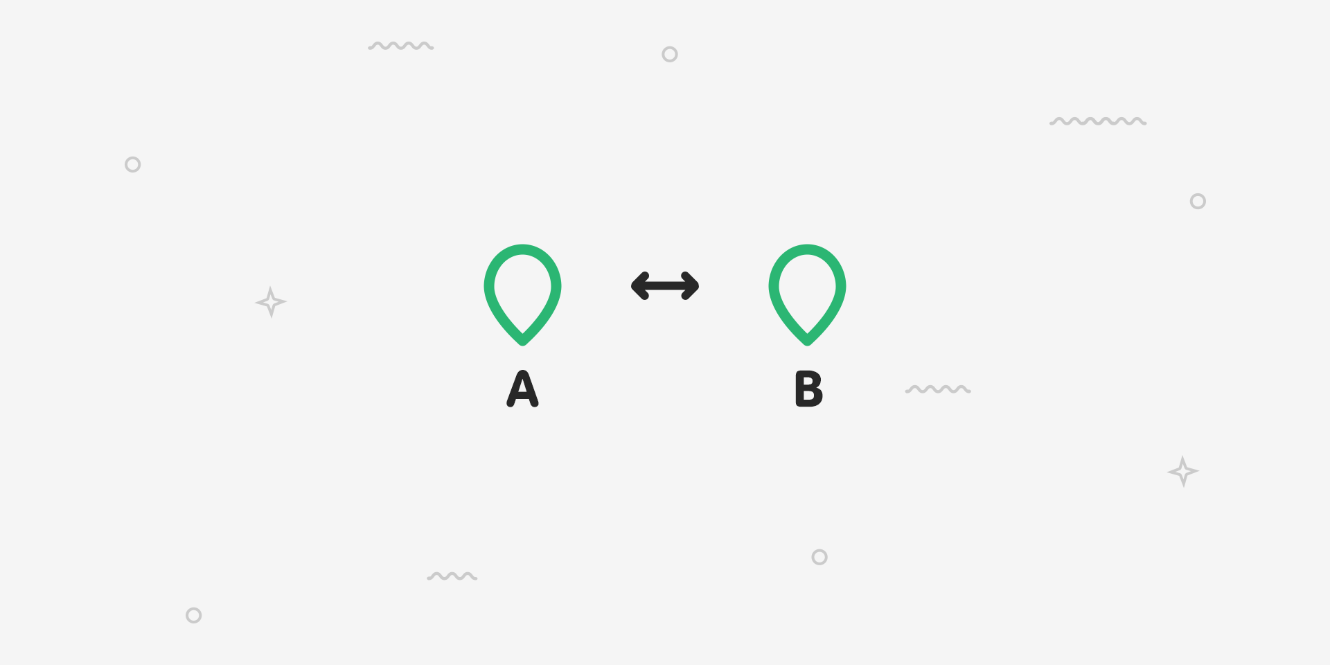
You are at point A, and your Granny is at point B. Helpiki are at point B as well, and they are going to deliver your care to your Granny. The logo idea was created by art director Zakhar Schlimakov. 

Then this idea was developed, improved, and refined. The logo is ready.
Stories 
We agree that we are going to tell real stories. And make a short presentation at the website and detailed reports on facebook. We set the story style and add some facts about the flooded apartment, the delivery of condensed milk to China, and about the American visa for a mom.
Website 
The stories here are very graphic. The map, photos of persons involved and helpiki appear when help is needed. People from Frankfurt am Main, Haifa, Toronto, Beijing, Malmö, and San Francisco. Each city has — its own icon.
Services are displayed on the screen one by one, stating what helpiki can and cannot — Andrey and Vladimir made up the list, at once coming up with the things they cannot do (“To configure Hubble telescope” or “To bring back the childhood”). We also provided information concerning the payment, contacts, and, of course, created the order form.


The way of presenting information and the design concept were created by Zakhar Schlimakov, drawn by Oleg Labunsky, while Katya Olipa and Ira Znosok helped to make improvements. 

The progress was quite quick until our technical director started asking hundreds of questions concerning the way blocks behave in horizontal versions.


So we got stuck with responsive design and struggled over the correct display of the project on mobile devices, while the screen-by-screen design and browsers refused to cooperate. But we continued negotiating. Vanya Pasechny continued working over the front-end, Dima Strapko was responsible for the back-end, while technical director Sasha Yakovlev juggled a wide variety of iPhones and iPads for testing.


Breathe in, breathe out, launch!  


It is important that helpiki get lots of orders! They will make new heartwarming stories appear that anyone would certainly like to share.
Testimonial: "The Red Graphic Digital Agency became a project mentor, not a mere contractor to develop the brand and website.
If we ever face the same challenge again — when we are unaware how to flesh out our idea, create a nice package for it, and share it on the Internet while explaining details — we will be knocking on the Red Graphic door again.
We are grateful to the entire Red Graphic team for the website. Special thanks go to Nadya Zelenkova and Zakhar Shlimakov".

CREATIVE TEAM

name by Nadya Zelenkova

design concept, logo by Zakhar Shlimakov

design by Oleg Labunsky

planning by Sasha Smorodsky

copywriting by Olya Myslivchik

page layout by Vanya Pasechny

programming by Dima Strapko

technical director Sasha Yakovlev

client manager Nadya Zelenkova