Before starting the design update works we audited the current version of the customer’s website. We identified the most and the least popular pages, analyzed the users’ behavior, the sources of traffic leading to conversion. The new version of the resource was designed based on the audit results.
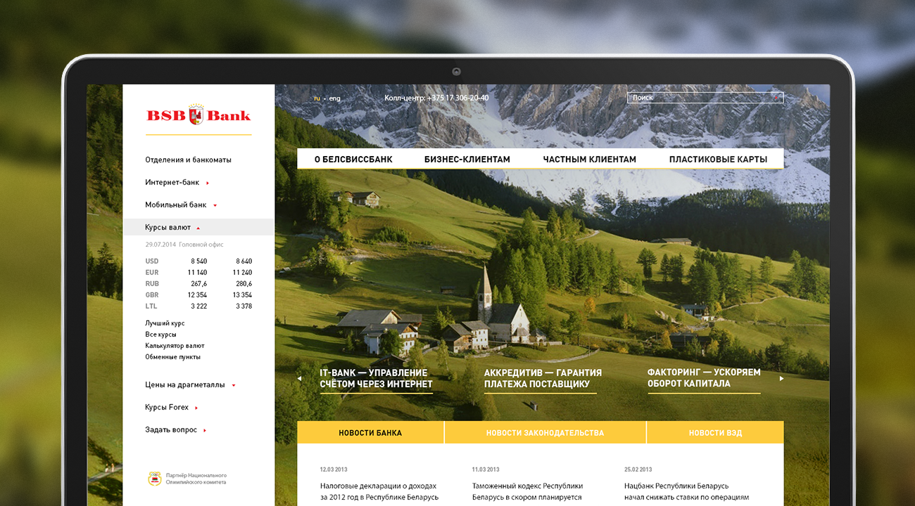
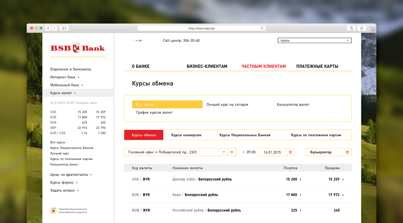
The new home page features all necessary information for individuals and legal entities: currency exchange rates, opening accounts, services provided to business customers, plastic cards, bank’s news, and contact information. Besides, while creating the design pattern of the home page the visibility and level of nesting of the current version’s most popular landing pages (for instance, “Currency Exchange Rates” and “Internet Banking”) was retained.
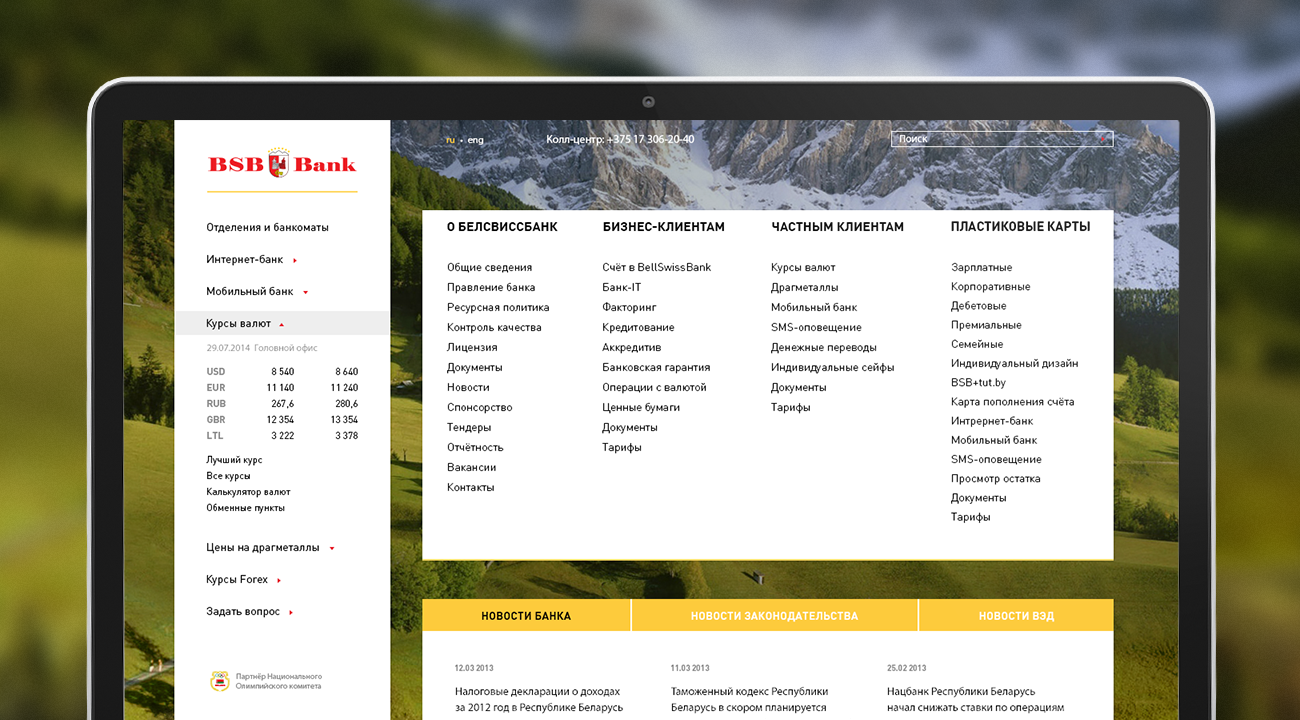
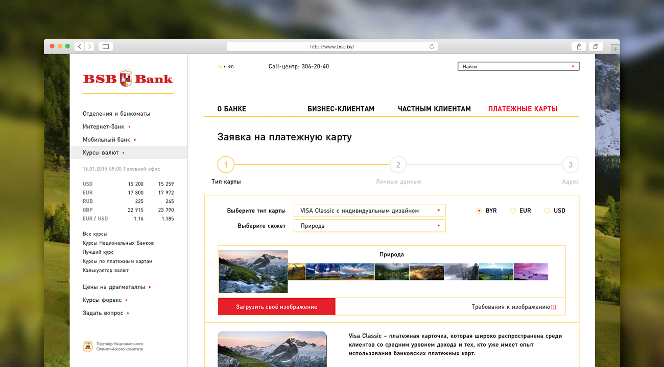
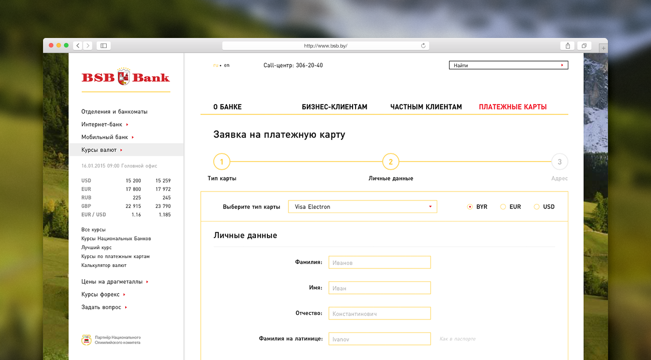
The navigation menu is central to the homepage and consists of four main sections: “About Bank”, “To Business Customers”, “To Individual Customers”, “Plastic Cards”. A detailed menu including all significant website’s materials is shown on clicking at any of the sections. This solution helps reduce the degree of nesting and shortens the conversion paths. All information about all services is presented in an understandable and concise way: an unnecessary landing page was deleted thus preventing the user from “jumping” from section to section in the search for necessary information. Maximum nesting of any material in the new version was equal to three levels.
Big background illustrations were used in the home page design. The customer has an opportunity to change them without any professional help if necessary (for instance, choose a background that would correspond to the season of the year or current marketing activities).